How Small? How Big?
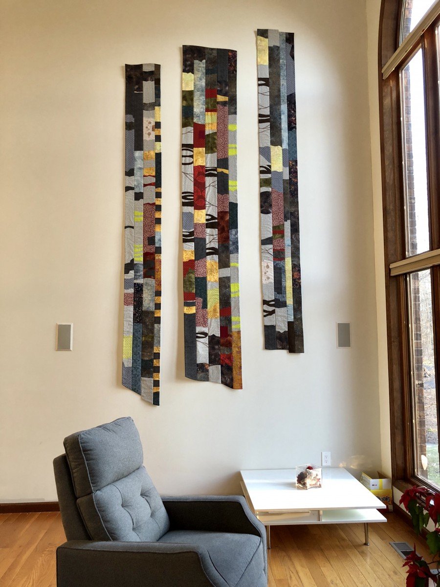
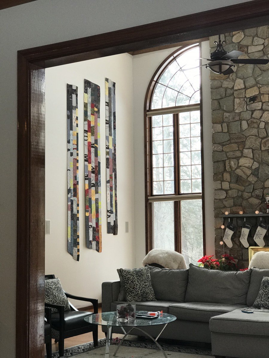
The size of a project makes a difference.You might have to get a riding lawn mower! Buy lots of trowels, so the kids can help with the weeding! Budget more than one quick weekend to paint the house! In the fabric art that I do, the two extremes of big and tiny seem the most challenging. Are you more intimidated by a very large job or by a very small job? I'm going to talk about creating artwork, but I think any observations I make about scale, apply to many jobs - coreography, landscape design, catering, city planning, writing a speech, etc...Obvious differences in size of job include 1) Cost - money, room to work and time 2) Amount of finish and detail needed 3) PresentationSimilarities are 1) Less is more (This is true of my artistic voice, but maybe not your red wine aesthetic with complex overtones.) 2 ) Line, proportion, composition 3) Communication of ideasIn the sweet spot between Christmas and New Years, I began work on a large scale piece for the tall wall at my son's home. The wall is 18 feet high and probably 12 - 14 feet across. The windows and fireplace in this room are massive. The artwork had to be at least 5 feet wide by 10 or more feet high.
 The biggest problem was having a place to work. There is no place in my house with a wall large enough to see the work in a vertical way as I composed it. I cleared off the ping pong table in my studio. Most of the table had not seen the light of day in over a year! All my piles (ordered or not) had to be filed. The entire studio space needed to be cleared and cleaned. The table is about the right width, but not long enough, I fashioned an extension table by putting a folding table on blocks to make it match the ping pong table in heighth. Working flat on a table is not ideal. It means you always have a distorted idea of what you're seeing, even if you get up on a short ladder from time to time.
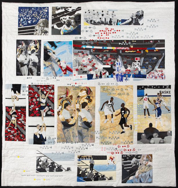
 I elected to pre wash all the fabrics, because the quilt artwork might need to be washed once in a while. Buying of fabric.... washing and ironing ... the table prep.... took time. I cut the fabrics into strips 5 inches, 4 inches, and 3 inches wide. I laid these strips on the table top until it was covered, using most of the accent red in the middle area, and using a larger quanity of the most neutral greys, browns, and grey blue. I decided location of the three sections of the artwork. I created two repeating motifs to help tie the quilt together. I did a bunch of sewing strips together and ironing flat.When the sections were back on the table, I was mostly happy with the correlations between the sections, but was disturbed by the proportion of accent colors distributed too far and wide. From a distance (squinting at it from another room), it was too much like pizza toppings! Not what I wanted.Time for a second draft! To fix this look, I would need to tone down many areas by adding more neutrals and covering up some of the red. (I really liked the red batik fabric, so this wasn't easy to do, but necessary.) No matter what the scale of a piece, the proportion of accent color, is surprisingly small. The olive green and stone blue grey fabrics helped a lot in toning down the effect of the red.This tall wall piece would not be seen close up, so detail was not as important as the visual punch of the repeating motifs and the proportion of accents being spot on. In the end, I am pleased with this large piece, and especially that the suggestion of the woods was brought into the room.At the top of the blog is an example of a large piece, Basketball Orchestration, that has a good deal of detail, but also repeating motifs and a reasonable proportion of accent color. The busy quality of this piece adds to the noisy idea of a basketball tournament.
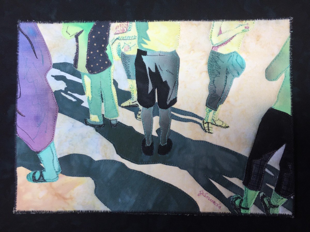
 Now I'd like to briefly talk about the challenge of working very small. Presentation is different. When it's a little fabric thing, it has to be mounted on a canvas to give it presence and announce to the world that it is artwork and not a pot holder! It will be seen close up, so the sort of detail must be spot on. Less is more. What are the elements of line and composition that must be there, and what is edited out? There is literally no room for everything. What fabrics will help me say what this piece is about? Keep it simple. Is there something unexpected that will keep the viewer looking, for a bit longer? I sometimes hide a detail or two in the large scale work also, so that the viewer is rewarded for looking at it close up.Perfect little snack recipe: Spread tahini (or peanut butter) on leaves of red cabbage and top with raisins or bits of apple. Enjoy.

