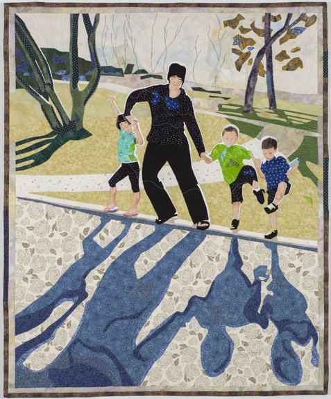
Everyone is happy
When a commission turns out well, everyone is happy. The woman who asked me to make a piece based on a photo of herself and her children, was already familiar with my artwork. She knew about my medium, style, subject matter, and my love of light and shadow. She could safely feel that I was a good fit for what she had in mind. She showed me the photo before I agreed to take on the project.In the innitial interview I asked her questions about her house and colors of her decor. Were there colors she would not want me to use. Was it OK with her if I changed some of the colors presented in the photo? Was it OK if I edited out some of the elements, like a picnic table that was behind the little girl? Since it was a very active image, I was seeing this piece with a border of some kind (to contain it). I showed her ways that I have finished the edge on other pieces, and got her responses about that.As an artist, we love it when the client gives us a lot of freedom to make any changes that will improve the work as a piece of art. The client wants a keepsake and the artist wants to create quality artwork. When both happen then everyone is happy. These are the things that I did that were a change from the reference photo: I cropped the very top portion of the image so there is less tree and sky proportionally, thus improving the composition. I simplified and abstracted this top area and moved trees slightly. I eliminated a tree that originally was growing out of Mom's head. The movement of the trees are still present in the quilting of the background. I removed a picnic table and moved the placement of a shadow on the right edge. I exagerated the halo of light behind each of the people. I changed colors of the outfits worn by every person. I exagerated the blue gray color of the shadow and the blue green color of the tree shadow on the left. By doing this, shadows and outfits were made more harmonious to eachother. I lastly added many bits of the shadow blue up into the trees on both sides. Before doing this, the shadow seemed too dominant to me. After circulating this color, it all looked good.
